Color modes (Light/Dark)
Cartzilla supports both Light and Dark color modes (commonly referred to as themes). Users can seamlessly switch between these modes using the theme switcher. However, there may be instances when:
- You require only one mode, either Light or Dark.
- You want the Dark mode to be the default setting.
Let's explore these scenarios in detail and discuss how to effectively manage them.
Only Light mode, removing Dark mode entirely
-
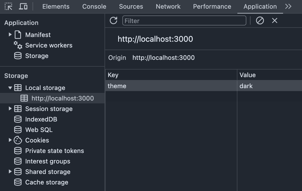
Clear browser local storage: Begin by clearing the browser's local storage to remove any saved theme variables. In the Chrome browser, this can be done through the Application panel.

-
Remove mode-switching code: Remove the link to the mode-switching JavaScript code from the
<head>section of your HTML document. Refer to the code snippet below for guidance.<!-- Theme switcher (color modes) --> <script src="assets/js/theme-switcher.js"></script> -
Remove theme switcher markup: Delete the theme (color mode) switcher markup from the
navbar. See the code snippet below for details.<!-- Theme switcher (light/dark/auto) --> <div class="dropdown"> <button type="button" class="theme-switcher btn btn-icon btn-secondary fs-lg rounded-circle animate-scale" data-bs-toggle="dropdown" data-bs-display="dynamic" aria-expanded="false" aria-label="Toggle theme (light)"> <span class="theme-icon-active d-flex animate-target"> <i class="ci-sun"></i> </span> </button> <ul class="dropdown-menu start-50 translate-middle-x" style="--cz-dropdown-min-width: 9rem; --cz-dropdown-spacer: .5rem"> <li> <button type="button" class="dropdown-item active" data-bs-theme-value="light" aria-pressed="true"> <span class="theme-icon d-flex fs-base me-2"> <i class="ci-sun"></i> </span> <span class="theme-label">Light</span> <i class="item-active-indicator ci-check ms-auto"></i> </button> </li> <li> <button type="button" class="dropdown-item" data-bs-theme-value="dark" aria-pressed="false"> <span class="theme-icon d-flex fs-base me-2"> <i class="ci-moon"></i> </span> <span class="theme-label">Dark</span> <i class="item-active-indicator ci-check ms-auto"></i> </button> </li> <li> <button type="button" class="dropdown-item" data-bs-theme-value="auto" aria-pressed="false"> <span class="theme-icon d-flex fs-base me-2"> <i class="ci-auto"></i> </span> <span class="theme-label">Auto</span> <i class="item-active-indicator ci-check ms-auto"></i> </button> </li> </ul> </div> -
Disable dark mode styles: Set the
$enable-dark-modevariable to false insidesrc/scss/_user-variables.scss. Once compiled, the CSS will no longer include dark mode styles.
Only Dark mode, disabling the Light mode option
-
Clear browser local storage: Begin by clearing the browser's local storage to remove any saved theme variables. In the Chrome browser, this can be done through the Application panel.

-
Set default to dark mode: Set the
data-bs-themeattribute to "dark" on the<html>tag to ensure the webpage loads in dark mode by default.<!DOCTYPE html> <html lang="en" data-bs-theme="dark"> ... </html> -
Remove mode-switching code: Remove the link to the mode-switching JavaScript code from the
<head>section of your HTML document. Refer to the code snippet below for guidance.<!-- Theme switcher (color modes) --> <script src="assets/js/theme-switcher.js"></script> -
Remove theme switcher markup: Delete the theme (color mode) switcher markup from the
navbar. See the code snippet below for details.<!-- Theme switcher (light/dark/auto) --> <div class="dropdown"> <button type="button" class="theme-switcher btn btn-icon btn-secondary fs-lg rounded-circle animate-scale" data-bs-toggle="dropdown" data-bs-display="dynamic" aria-expanded="false" aria-label="Toggle theme (light)"> <span class="theme-icon-active d-flex animate-target"> <i class="ci-sun"></i> </span> </button> <ul class="dropdown-menu start-50 translate-middle-x" style="--cz-dropdown-min-width: 9rem; --cz-dropdown-spacer: .5rem"> <li> <button type="button" class="dropdown-item active" data-bs-theme-value="light" aria-pressed="true"> <span class="theme-icon d-flex fs-base me-2"> <i class="ci-sun"></i> </span> <span class="theme-label">Light</span> <i class="item-active-indicator ci-check ms-auto"></i> </button> </li> <li> <button type="button" class="dropdown-item" data-bs-theme-value="dark" aria-pressed="false"> <span class="theme-icon d-flex fs-base me-2"> <i class="ci-moon"></i> </span> <span class="theme-label">Dark</span> <i class="item-active-indicator ci-check ms-auto"></i> </button> </li> <li> <button type="button" class="dropdown-item" data-bs-theme-value="auto" aria-pressed="false"> <span class="theme-icon d-flex fs-base me-2"> <i class="ci-auto"></i> </span> <span class="theme-label">Auto</span> <i class="item-active-indicator ci-check ms-auto"></i> </button> </li> </ul> </div>
Setting Dark mode as the default
-
Clear browser local storage: Begin by clearing the browser's local storage to remove any saved theme variables. In the Chrome browser, this can be done through the Application panel.

-
Set default to dark mode: Set the
data-bs-themeattribute to "dark" on the<html>tag to ensure the webpage loads in dark mode by default.<!DOCTYPE html> <html lang="en" data-bs-theme="dark"> ... </html> -
Update theme switcher markup: Modify the theme (color mode) switcher markup slightly to ensure that dark mode is selected by default. Refer to the code snippet below for guidance.
<!-- Theme switcher (light/dark/auto). Set "dark" by default --> <div class="dropdown"> <button type="button" class="theme-switcher btn btn-icon btn-secondary fs-lg rounded-circle animate-scale" data-bs-toggle="dropdown" data-bs-display="dynamic" aria-expanded="false" aria-label="Toggle theme (dark)"> <span class="theme-icon-active d-flex animate-target"> <i class="ci-moon"></i> </span> </button> <ul class="dropdown-menu start-50 translate-middle-x" style="--cz-dropdown-min-width: 9rem; --cz-dropdown-spacer: .5rem"> <li> <button type="button" class="dropdown-item" data-bs-theme-value="light" aria-pressed="false"> <span class="theme-icon d-flex fs-base me-2"> <i class="ci-sun"></i> </span> <span class="theme-label">Light</span> <i class="item-active-indicator ci-check ms-auto"></i> </button> </li> <li> <button type="button" class="dropdown-item active" data-bs-theme-value="dark" aria-pressed="true"> <span class="theme-icon d-flex fs-base me-2"> <i class="ci-moon"></i> </span> <span class="theme-label">Dark</span> <i class="item-active-indicator ci-check ms-auto"></i> </button> </li> <li> <button type="button" class="dropdown-item" data-bs-theme-value="auto" aria-pressed="false"> <span class="theme-icon d-flex fs-base me-2"> <i class="ci-auto"></i> </span> <span class="theme-label">Auto</span> <i class="item-active-indicator ci-check ms-auto"></i> </button> </li> </ul> </div> -
Update default mode in theme switcher JS code: Modify the
assets/js/theme-switcher.jsfile to set "dark" mode as the default. This change ensures that the website initializes in dark mode when first loaded. Refer to the code snippet below for guidance./** * Switch between light and dark themes (color modes) * Copyright 2024 Createx Studio */ ;(() => { 'use strict' const getStoredTheme = () => localStorage.getItem('theme') const setStoredTheme = (theme) => localStorage.setItem('theme', theme) const getPreferredTheme = () => { const storedTheme = getStoredTheme() if (storedTheme) { return storedTheme } // Set default theme to 'dark'. // Possible options: 'light' or system color mode (window.matchMedia('(prefers-color-scheme: dark)').matches ? 'dark' : 'light') return 'dark' } // ... rest of the code